
Web Design
How to Inventory UI Components Before Building a Design System
A component library often begins with buttons, cards, fields and navigation. First, find out which elements repeat across the product and which only look…
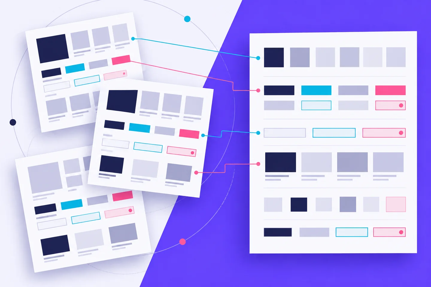
A component library often begins with buttons, cards, fields and navigation. First, find out which elements repeat across the product and which only look alike in a few screens.
A component inventory records where an element appears, what job it performs, how it changes and what happens when an interaction fails. It gives you a basis for deciding what to standardise. The U.S. Web Design System recommends starting by listing the components a site uses and checking for system equivalents. Link each entry to a real screen.
Start with tasks, then capture screens
Choose a few important workflows rather than attempting to catalogue every page at once. A workflow might include finding an item, filtering results, reviewing details and submitting a form. Capture each step on the platforms and screen sizes that matter to the product. Include the screens people see when results are empty, data is loading, an entry is invalid or an action succeeds.
Keep captures in task order. Nielsen Norman Group’s asset mapping method arranges the screens and other assets people encounter during a workflow so teams can compare functionality, content and appearance across channels. Use those captures as evidence for each proposed reusable element.
Give every capture a stable reference, such as a route, screen name or file link. Note the viewport, platform, date and state shown. If an error appears only after a particular action, record the action too. A screenshot without that context can show how a control looks while concealing why it appeared.
Now mark repeated elements on the captures. Use provisional names: “result card,” “filter control,” “form error” or “confirmation message.” Resist naming components after their visual treatment. “Blue bordered box” describes one appearance; “form error” describes a purpose that can be checked across screens.
Record the whole component, not its default appearance
For each candidate, collect its occurrences side by side. A button on a landing page and a button in a form may share colour and shape, yet differ in label length, importance and what follows activation. Record those differences before deciding whether they are variants of one component.
Inspect four dimensions:
- Purpose and content: What task does the element support? What labels, descriptions or data can it contain? What happens when text wraps or information is missing?
- Variants: Which differences express a meaningful role, such as primary and secondary actions? Which differences appear to be inconsistent styling?
- States: What appears during focus, selection, loading, success, error or unavailability? Which states are visible in the product, and which still need investigation?
- Accessibility behaviour: What is the control’s name? How is it reached and operated with a keyboard? Where does focus move? How are errors or changes announced and explained?
Observe implemented behaviour where possible. Design files can explain intent, but they may omit a validation message or show a menu that behaves differently in production. If a state cannot be inspected, mark it “unknown” in the inventory. An unknown is a useful finding; a guessed behaviour can turn into an inaccurate specification.
Check long headings, translated labels where available, missing descriptions and several errors at once. Confirm any apparent content limits with the people responsible for content and implementation.
Use a screenshot-to-inventory worksheet
Create one worksheet entry per candidate component and link to every supporting screen. Record:
- Candidate and purpose: A provisional name and the task it supports.
- Screen evidence: Captures, routes, platforms and states shown.
- Observed differences: Content, layout, variants, interaction and responsive changes.
- Accessibility: Known keyboard, focus, naming and feedback behaviour; unresolved questions.
- Reuse decision: Reuse, investigate, keep separate or fix an inconsistency, with a reason.
- Priority: The affected task, recurrence, user impact and work needed.
For example, a proposed “result card” might link to a search page, a saved-items page and their narrow layouts. The worksheet could show that all three present a title and description, but only the search card has a selectable state. That is a question to resolve, not an automatic reason to add a selection property to every card.
Keep observations separate from decisions. “The search card opens its detail page when the title is selected” is observable. “All cards should be clickable” is a proposal. This distinction makes review easier: colleagues can challenge the proposal without having to dispute what the captured screen shows.
When a candidate appears on many screens, record the distinct contexts rather than filling the worksheet with identical captures. Keep at least one example of each meaningful state, content shape and screen size. Add a reference to the implemented control when available, so a developer can compare the proposed rule with existing behaviour. Record disagreements as open questions and assign someone to check them against the product.
Separate true reuse from visual similarity
Two elements are good candidates for one component when they serve the same purpose and can follow the same content and interaction rules. Shared colour, radius or spacing alone is weaker evidence. Those visual decisions may belong in design tokens while the elements remain separate.
Consider a promotional panel and an error message with the same border and background. One invites exploration; the other helps someone recover from a problem. Combining them into a “panel” with many optional properties could hide their different content and accessibility requirements. Record the shared styling, then specify each pattern according to its job.
Test each proposed grouping with three questions. Can someone describe when to use it without referring to a particular page? Do its variants express clear differences in meaning? Can it accommodate the observed content and states without a growing collection of exceptions? If the answers are unclear, keep the candidates separate while you gather more evidence.
The reverse can also happen: elements that look different may perform the same task. If several forms explain errors in different ways, the inventory may reveal an inconsistency to resolve. Do not reproduce every existing treatment as an official variant. First decide which behaviour helps people understand and correct the problem.
Choose a focused first release
Prioritise candidates that appear in important workflows, recur across screens and create avoidable inconsistency or confusion. Consider the effort to document, build and test each one. A frequently used field with unclear error behaviour may deserve attention before a card that appears once.
Give each first-release candidate a short evidence statement: where it appears, what differs between those uses, which behaviour should be shared and what remains open. Name the screens that will be used to check the finished component. This creates a practical acceptance test: the component must work in those contexts, with their real content and states.
Use clear lifecycle labels for the remaining candidates. “Proposed,” “under investigation,” “ready to build” and “released” communicate different levels of certainty. The USWDS component status table shows how a public system can distinguish proposals from development and released components. Your inventory can use simpler labels, provided readers can tell what has been observed, decided and delivered.
Review the first release with designers, developers, content specialists and accessibility reviewers using the same screen references. Ask where a proposed rule would fail, which states are still missing and whether an existing implementation already solves the need. Update the worksheet as those questions are answered. The inventory should remain useful after launch: new screens can reveal a valid variant, an unnecessary exception or a component that needs to be split.