
Web Design
Design Fails

By Ada Monroe
A design fails when it does not support the people who must use, understand or trust it. The cause may be visual, technical or organisational, but the resu
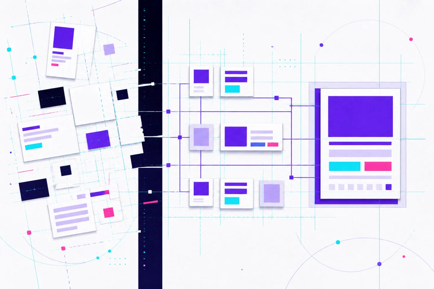
A design fails when it does not support the people who must use, understand or trust it. The cause may be visual, technical or organisational, but the result is observable: people misunderstand the purpose, miss a key action, make preventable errors or abandon the task.
Teams should judge a concept against the problem it was meant to solve, not personal taste. A polished screen can still fail if its central task is unclear, inaccessible or impractical to build. The useful response is to identify the failure, test its cause and decide whether to revise the execution or replace the underlying approach.
Recognising a Failing Concept
Begin by defining the non-negotiable outcomes. Can people identify what the feature does? Can they complete the primary action without help? Does the concept meet accessibility, technical and operational constraints? Does it improve the existing experience in a way the team can observe?
A single complaint may reflect preference. Repeated friction across usability sessions, support requests, error reports or task data indicates a pattern. Designers should test the riskiest assumption early and record what happened rather than defend the intended interpretation. Testing failure conditions early helps teams identify what needs mitigation before release, as discussed in designing for failure early.
Separate symptoms from causes. A symptom describes what happened: people missed a button, abandoned a form or misunderstood an error. The cause explains why. A form may be abandoned because it requests unnecessary information, hides essential details, performs poorly on a small screen or gives no clear route back from an error.
Map the task step by step, compare what the design expects with what people actually do, and examine where expectations diverge. If changes to copy, hierarchy or interaction remove the friction, the concept may remain sound. If repeated revisions cannot make the central task understandable or feasible, choose a different direction.
Make Visual Decisions Serve the Task
Visual hierarchy should show what matters first, second and last. A page heading establishes context, the primary action advances the task, and supporting details remain available without competing for attention. Size, weight, contrast, spacing and position should reinforce the same order.
If every card, label, icon and button uses strong contrast, the screen gives everything equal urgency. A quick blur or greyscale review can expose this problem. The heading, main content and primary action should remain distinguishable even when decorative detail recedes.
Informed design decisions also account for user needs, business goals and technical constraints rather than treating visual preference as the deciding factor. Decoration should support comprehension. A texture, illustration, gradient or animation earns its place when it clarifies a state, distinguishes a category or reinforces a meaningful action.
Analyses of colour design failures identify visual strain and communication confusion as practical consequences of poorly chosen palettes. Define a small visual language: one treatment for primary actions, a consistent warning colour, familiar icons with labels where meaning could vary, and motion reserved for feedback or changes of state. Remove any choice that delays recognition, reduces legibility or makes secondary controls look equally important.
Prevent Misalignment Before Review
Broad goals produce opinion-led reviews. A brief that says only to increase engagement does not identify the audience, intended action or constraint. Translate it into observable criteria before design begins.
- Primary user: who needs to complete the task and what knowledge they bring.
- Required action: the specific decision or task the design must support.
- Success evidence: the behaviour that would show the task has become clearer or easier.
- Constraints: accessibility requirements, content needs, technical limits and delivery scope.
Written acceptance criteria prevent opinion-led reviews. They also reduce the kind of dimensional and specification discrepancies that create errors in structural design drawings. Rigid frameworks break down when teams ignore changing context or apply the wrong model, so criteria should permit an exception when evidence supports it.
Consistency also matters. A primary button should not become a text link on one screen and a decorative element on another without a documented reason. A useful system defines type scale, spacing, component states, content rules, responsive behaviour and accessibility requirements, not merely colours and logos.
Design files, component libraries and production code drift when teams duplicate components instead of updating the established pattern. Real-time ECAD–MCAD collaboration and a shared source of truth illustrate the same principle: connected decisions expose mismatches before they reach production. Record valid exceptions, who approved them and whether they should become reusable.
Test realistic conditions rather than an ideal path. People scan, backtrack, mistype, lose connections and arrive from links that skip the expected entry point. If a task includes a file upload, test missing files, unclear names, poor-quality inputs and slow connections. Research should examine whether people can complete and recover from tasks, not simply whether they like the appearance.
Turn Critique Into Action
Useful critique identifies a visible problem, connects it to a user or product goal and names the next question to resolve. Comments about how a design feels leave the designer guessing. State which element causes difficulty, describe the effect and connect the observation to evidence or an agreed principle.
For example, rather than calling a page confusing, explain that the primary action carries the same visual weight as secondary links, so the next step is difficult to identify. This defines a problem without prescribing an unsupported solution. Feedback should address the work, never the person. A bank of design critique questions that surface concrete issues can help reviewers examine hierarchy, states, content and intent.
Rank findings by user impact, risk and effort. A blocked task, inaccessible control or unrecoverable error requires attention before minor spacing or icon inconsistencies. Guidance on design critiques and design reviews also distinguishes problem-solving feedback from a stakeholder status update. A review should end with a short record of what will change, who owns the decision and what evidence will confirm it.
When reviewers disagree, return to the task flow, research, observed behaviour or an agreed accessibility requirement. Do not settle a user-facing decision through seniority. Clear roles, shared goals and agreed communication practices reduce common cross-team friction. Workplace collaboration strategies can help teams make dissent expected rather than personal.
A facilitator can structure dissent around three questions:
- What assumption is the design making?
- What evidence supports that assumption?
- What could fail for a particular user or edge case?
Record unresolved objections, assign an owner and state how the concern will be tested. This prevents valid warnings from disappearing when a meeting ends.
Build a Reliable Design Practice
After a failure, record the affected task, the original assumption, the observed outcome, the change made and the person responsible for follow-up. Keep the language factual and avoid blame. A note that the handover omitted an error state identifies a fixable gap; a judgement about someone’s competence does not.
Reliability practices benefit from considering failure throughout development, as outlined in reliability design principles. Prototype the riskiest parts of a workflow first: permission denial, empty states, delayed data, rejected input or a user returning after an interrupted task. Early tests should measure observable outcomes such as completion, errors or whether people can find a critical action.
Before release, define the intended scope, the evidence to review and who may pause or reverse the change. Preserve a safe recovery path when a change affects a critical task. Test unavailable services, slow responses and incomplete data instead of assuming every dependency will behave perfectly. For further reading, see guidance on resilient application design.
A design failure is useful only when it changes the next decision. Clear criteria expose weak assumptions; realistic testing shows where they break; specific critique turns evidence into action; and written follow-up prevents the same mistake from returning. That practice produces work that is easier to understand, build, operate and improve.